Wednesday, 4 May 2011
Looking back at your preliminary task, what do you feel you have learnt in the progression from it to the full product?
Since the Preliminary take, my understanding of In design and photoshop has improved, Originally i'd be asking constantly what i do, and could never keep on track, however, since my understanding of both has improved, I can do a lot more on both programs that i originally could and and keep up with the task, although i've still a lot more to learn about both however what i have learned i feel shows in a difference, although my music magazine is not totally brilliant, in fact far from it, I still think i've learned so much since the start of the year from the preliminary task
What have you learnt about technologies from the process of constructing this product?
I've used several technologies throughout the year and throughout creating my magazine.
In design is a program from Adobe used mainly on making magazines, this program is used by many professionals to create magazines throughout the media. The are plenty of different tools which allows users to create pages however many of these tools are difficult to use and understand, and may take a while to get used to.
I used In design to create the pages to my magazine using all sorts of tools to do so, I found alot of the tools difficult and confusing but i feel with time i could get used to it. Since i had never used in design before everything was new to me, so i have learned to create magazines easily using this program.
Photoshop is a program used to edit photos in all sorts of ways, the amount of options and tools available to you are practically limitless, however, it could take a long time to know how to use all of these tools, perhaps many never will as adobe always add new features. I had rarely used in design before, and learn about all kinds of tools I'd never seen before, and learned all about PDF's and CMYK.
I used survey monkey to make my survey results, survey monkey simply is what i says, a survey site, used to make surveys and record data. The feedback i received influenced slightly my decisions in what i did with my magazine
How did you attract/address your audience?
I used a bright green colour that attracts the audiences eyes to the magazine, and also large font. Seeing green and a large font in my opinion is very eye catching and appealing. Since the title goes across the entire top of the page it can also be seen on the left third if behind other magazines.
I made sure my magazine would feature articles that my readers would want to see, for their particular interest. Also chances for competitions and winning things that would attract people eyes if they saw it in the shops
I made sure my magazine would feature articles that my readers would want to see, for their particular interest. Also chances for competitions and winning things that would attract people eyes if they saw it in the shops
Who would be the audience for your media product?
My audience of to both males and females, all races, all sexualities and people between the ages of 13 and 30. I've chosen to have such a wide audience to try something different, or challenge conventions. I thin this could be quite beneficial to my magazine choosing this range of audience because it could make more sales, and attract all types of people from all different backgrounds all in the interest of music, eventually perhaps in reading this magazine readers music tastes could also broaden rather than listen to one or two genres of music.
as for the older generation, this can help them keep up with today's music, whatever the genre, whatever you like to listen to, the magazine will appeal to almost everyone.
as for the older generation, this can help them keep up with today's music, whatever the genre, whatever you like to listen to, the magazine will appeal to almost everyone.
What kind of media institution might distribute your media product and why?
I looked at several different institutions such as Bauer Media and Conde Nast, But i decided Bauer Media would be the right choice to make.
I've chose Bauer Media because i feel it has more experience in marketing music magazines such as Kiss, Kerrang and 4 music.
IPC Media, is not as renowned as as either Conde Nast or Bauer and focuses mainly on selling woman's magazines, food and gardening so the felt that they were not the right choice to make.
Conde Nast may be a bigger distributor than Bauer, and has been around for longer but they yet again have nowhere near as much experience in dealing with music magazines, they publish mainly high end fashion magazines such as vogue and vanity fair.
In what ways does your media product use, develop or challenge forms and conventions of real media products?
My magazine Challenges other magazines because of my wide range of audience I have chosen, no magazines include all genre's of music, and aim towards all listeners of music. However it conforms by keeps page layouts similar to post magazines, articles included the same and most magazines and generally keeps the same apart from my choice of a wide audience.
I chose to have a wide audience simply because I wanted to challenge the norm, All magazines keep to a certain audience, I thought My magazine could be different to these other magazines, then attracting more readers to it, rather than one type of audience
However i decided to keep all other aspects of my magazine the same because i felt if i challenged conventions too much it could all go wrong in which way i'd then have a failed magazine.


Analysis of survey results
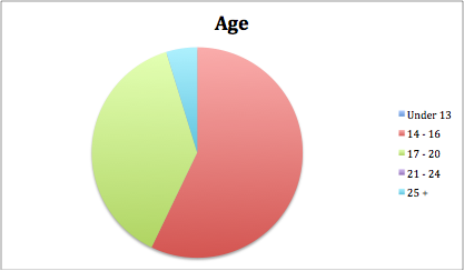
Most of the participants who took part in answering my survey were between the ages of 13 and 20 and one person being over the age of 25, this shows that mainly a younger audience read music magazines, also there were more females than males that took part in the survey.
Kerrang was the most popular magazine with the people that answered followed by rock sound, suggesting the people that answered prefer the a heavier genre of music.
Peoples opinions of My magazines name, contents and genre ranged, some people thought it sounded like a magazine for mainstream bands, new upcoming bands and so on
Survey Results Analysis


http://www.surveymonkey.com/MySurvey_EditorFull.aspx?sm=AzSxW2lVfKLoiZJhvd9m2S5KlEPzstKX9Tx06AfvzaA%3d
Analysis of double page spread
The double page spread in an interview with a new American artist. It show 8 small images at the top of the page going from left to right of the artist pulling poses by himself and with a fellow bandmate and doing live gigs.
The interview is not Q & A and rather as just a is just free flowing, throwing in quotes from the artist at certain points, and explaining about him and what he is doing. The interview is well layed out across the page, making it easy to follow unlike the contents.
The start of the interview is instantly informal as it starts with the word "fuck" and the F is coloured in red and large and bold, attracting the eye, knowing this is the start of the interview.
The page and pictures yet again keep to the colour scheme of the front page, red, white and gold.
Also the is an artist profile on the page, coloured in red making it eye catching.
Analysis of contents
NME - The magazine's contents page has several small images of different artists with tag lines underneath giving quotes, page numbers and what is on the page. The page is white, keeping with the rest of the magazine. The there are several different fonts, bold and italics perhaps to separate the sections or highlight different parts of the magazine. The page is quite messy, and all over the place, the pictures only show the big stories on pages far away from each other, making it confusing.
Tuesday, 3 May 2011
Analysis of front covers
NME-
 NME or New Musical Express is a music magazine targeted towards a ranged audience, similar to my magazine. Their Masthead is on the left third, they do this as it is easy to spot under over magazines as the top left side is normally the only part of a magazine behind others in view in retailers. NME also as shown on this example, only use one main image on their cover, the image slighty goes over the E on the masthead, the large image can catch consumers eyes more than several smaller images. The Headline or coverling is big and bold also to catch attention, as are the smaller coverlines and the magazine header bar also.
NME on the cover have kepts to a certain continuity with font and colours, the font is all the same, and the cover uses the same 3 colours throughout the page, Red, Gold and White, this stops the page from looking messy, un-organised and unprofessional, even the clothing and props the artist in the image has keeps to this colour code, apart from the blue at the top of his jumper.
The barcode also has the price, date of issue release and issue number on it, these are small on the barcode as they are not as much as a thing of interest to consumers or are not selling points.
Although NME has normally a miced audience, this cover shows more masculinity as the colours and image appeal more for a male audience rather than female.
Subscribe to:
Comments (Atom)