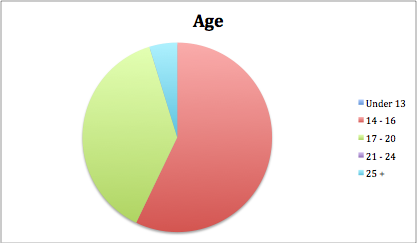
Most of the participants who took part in answering my survey were between the ages of 13 and 20 and one person being over the age of 25, this shows that mainly a younger audience read music magazines, also there were more females than males that took part in the survey.
Kerrang was the most popular magazine with the people that answered followed by rock sound, suggesting the people that answered prefer the a heavier genre of music.
Peoples opinions of My magazines name, contents and genre ranged, some people thought it sounded like a magazine for mainstream bands, new upcoming bands and so on
Showing posts with label Planning. Show all posts
Showing posts with label Planning. Show all posts
Wednesday, 4 May 2011

Survey Results Analysis



http://www.surveymonkey.com/MySurvey_EditorFull.aspx?sm=AzSxW2lVfKLoiZJhvd9m2S5KlEPzstKX9Tx06AfvzaA%3d
Analysis of double page spread
The double page spread in an interview with a new American artist. It show 8 small images at the top of the page going from left to right of the artist pulling poses by himself and with a fellow bandmate and doing live gigs.
The interview is not Q & A and rather as just a is just free flowing, throwing in quotes from the artist at certain points, and explaining about him and what he is doing. The interview is well layed out across the page, making it easy to follow unlike the contents.
The start of the interview is instantly informal as it starts with the word "fuck" and the F is coloured in red and large and bold, attracting the eye, knowing this is the start of the interview.
The page and pictures yet again keep to the colour scheme of the front page, red, white and gold.
Also the is an artist profile on the page, coloured in red making it eye catching.
The interview is not Q & A and rather as just a is just free flowing, throwing in quotes from the artist at certain points, and explaining about him and what he is doing. The interview is well layed out across the page, making it easy to follow unlike the contents.
The start of the interview is instantly informal as it starts with the word "fuck" and the F is coloured in red and large and bold, attracting the eye, knowing this is the start of the interview.
The page and pictures yet again keep to the colour scheme of the front page, red, white and gold.
Also the is an artist profile on the page, coloured in red making it eye catching.
Analysis of contents
NME - The magazine's contents page has several small images of different artists with tag lines underneath giving quotes, page numbers and what is on the page. The page is white, keeping with the rest of the magazine. The there are several different fonts, bold and italics perhaps to separate the sections or highlight different parts of the magazine. The page is quite messy, and all over the place, the pictures only show the big stories on pages far away from each other, making it confusing.
Tuesday, 3 May 2011
Analysis of front covers
NME-
 NME or New Musical Express is a music magazine targeted towards a ranged audience, similar to my magazine. Their Masthead is on the left third, they do this as it is easy to spot under over magazines as the top left side is normally the only part of a magazine behind others in view in retailers. NME also as shown on this example, only use one main image on their cover, the image slighty goes over the E on the masthead, the large image can catch consumers eyes more than several smaller images. The Headline or coverling is big and bold also to catch attention, as are the smaller coverlines and the magazine header bar also.
NME on the cover have kepts to a certain continuity with font and colours, the font is all the same, and the cover uses the same 3 colours throughout the page, Red, Gold and White, this stops the page from looking messy, un-organised and unprofessional, even the clothing and props the artist in the image has keeps to this colour code, apart from the blue at the top of his jumper.
The barcode also has the price, date of issue release and issue number on it, these are small on the barcode as they are not as much as a thing of interest to consumers or are not selling points.
Although NME has normally a miced audience, this cover shows more masculinity as the colours and image appeal more for a male audience rather than female.

NME on the cover have kepts to a certain continuity with font and colours, the font is all the same, and the cover uses the same 3 colours throughout the page, Red, Gold and White, this stops the page from looking messy, un-organised and unprofessional, even the clothing and props the artist in the image has keeps to this colour code, apart from the blue at the top of his jumper.
The barcode also has the price, date of issue release and issue number on it, these are small on the barcode as they are not as much as a thing of interest to consumers or are not selling points.
Although NME has normally a miced audience, this cover shows more masculinity as the colours and image appeal more for a male audience rather than female.
Monday, 18 April 2011
Target audience for my magazine
My target audience is ranged since my magazine is going to be ranged in genre


 These are pictures of the type of audience i mean by ranged, there are adults and teenagers included here which is what i and aiming towards


Subscribe to:
Posts (Atom)